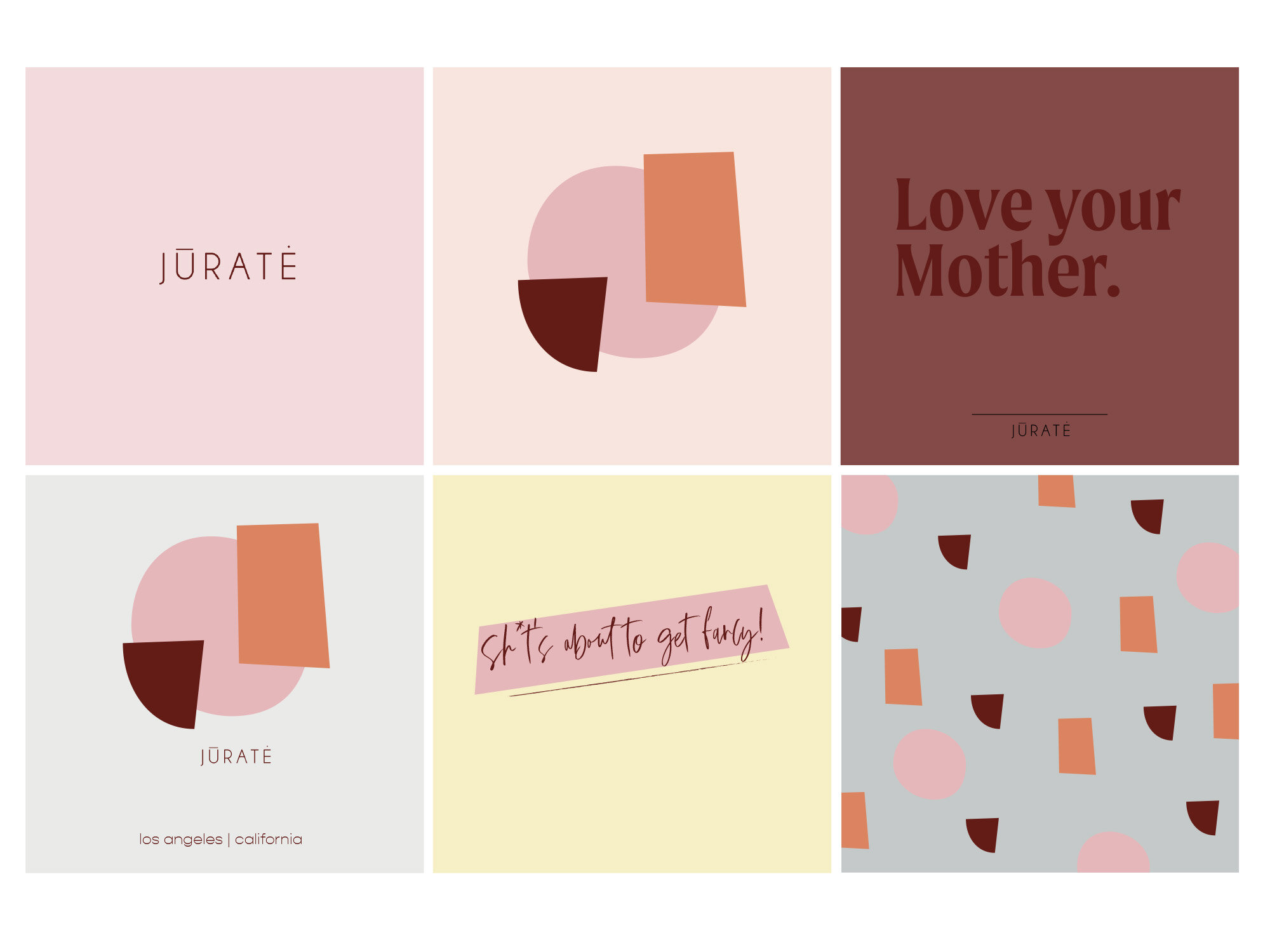
Jurate is an on- trend demi-fine jewelry line based in Southern California. Every piece is designed with quality and sustainability in mind. Because sustainability is important to Jurate, Mother Earth was the main inspiration for your secondary logo/logomark. We used timeless, simple, and fun abstract shapes to represent the Earth. Minimal shapes are easy for customers to remember, the size will be easy to scale up or down, and these types of designs work well on both print and digital platforms.
From conversations with the Jurate team, it was clear that their brand should also evolve feelings of playfulness with a bit of an edge, and female empowerment. We did this by pairing shades of pinks and oranges with pops of greens to create a feminine and refreshing color palette.
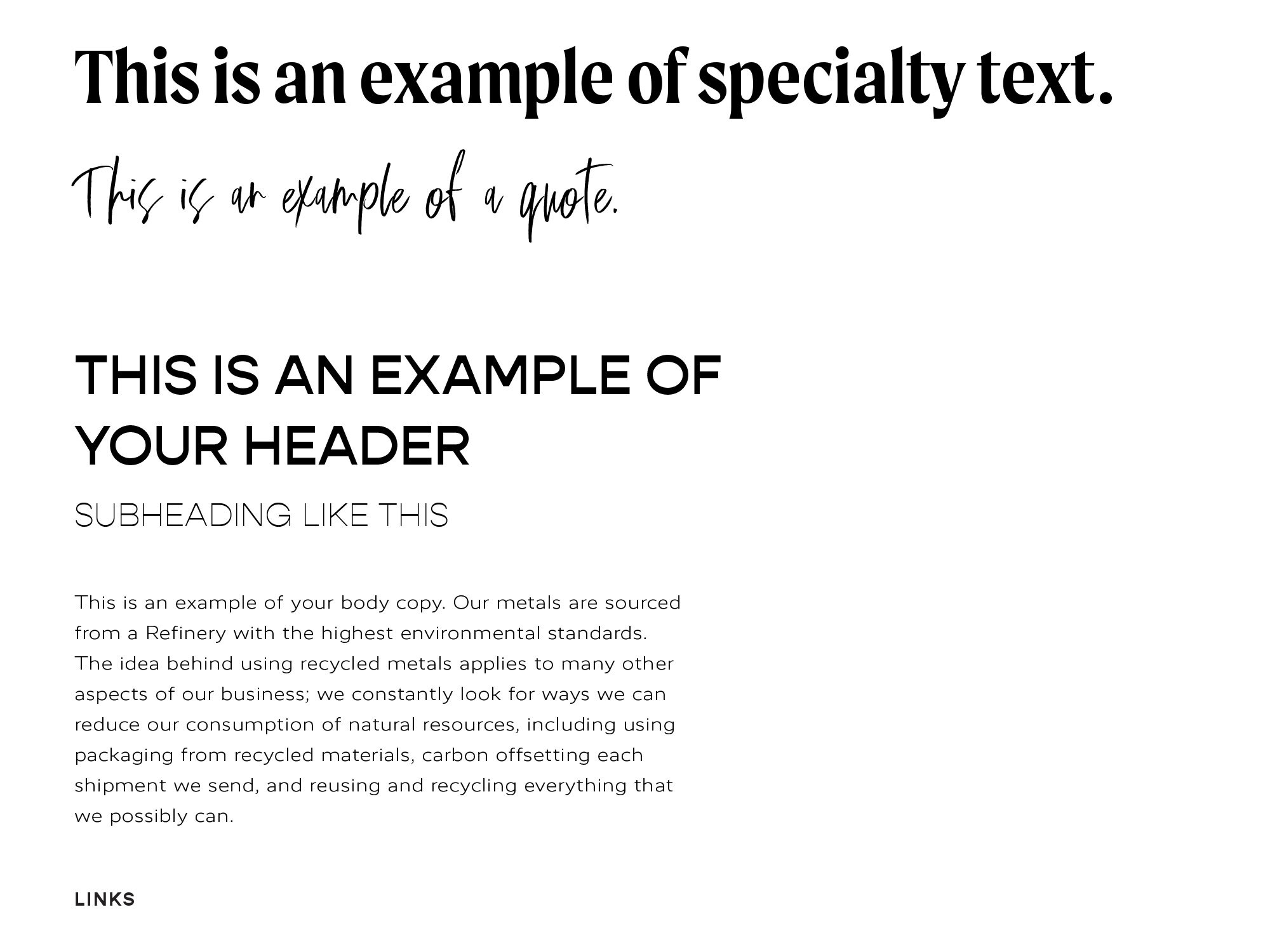
Drawing on their keywords of current, modern, playful, and empowerment, the font selections include handwritten lettering, quirky sans serifs, and a strong bold type that resonates with your customer. Although all of these fonts are different, they all complement each other when together, but can also make a statement when standing alone.